Path Finder: A Finder Alternative?
Until OS X 10.5 arrives on our computers at what is supposed to be the latter part of this year, we’re going to be stuck with the rather poor and awkward Finder that is ever present in our current systems.
Since switching from a Windows environment, I’ve not been particularly happy with the way we’re able to find, open and save files within the system. Now don’t get me wrong, in my honest opinion I believe that OS X completely batters Windows all over the place, but the one area Windows wins, is the Start Menu.
In a past article, I went over a file menu system called FileGazer, which allows you to have a ‘Start Menu’ style system active on your Mac. Although it seemed useful, it lacks some major functions like being able to edit file names and move files around. However, I’ve stumbled across another application which has been out for quite some time, called Path Finder.
Path Finder is basically an advanced Finder and completely opposite to the way that FileGazer works. It’s for those of you out there who like to see a little more information, easily, on your files and folders as well as those who are frustrated by Finder’s limited features.
What’s in it?
Using the image below as a reference, you can see that in its simplest form, Path Finder already looks like an advanced Finder.
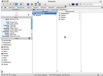
1. The first window is known as the Drop Stack. The Drop Stack allows you to drop a load of files, whether movies, photos, music or any other documents, and then either burn them to disc or compress and e-mail. Any number of mixed files can be dropped here, your only limit is the size of the disc you plan to burn to.
2. The second window, like the rest of the windows available, is customizable. Users are able to turn this window into the following information panes simply by selecting the drop down list above each window:
Volumes - Allowing you to access the different volumes available on your drive
Processes - The process pane shows up a list of currently running applications. Although at first rather useless, especially as the Dock features the running applications anyway, you can actually quickly close an application, as well as all applications in one swipe, via a simple click of the button
File History/Folder History - These two panes are separate but work in exactly the same way. Any file or folder you’ve opened within Path Finder will list up here and is an easy way to access previously opened items. Unfortunately, it doesn’t offer anything extra over the built in File History in OS X with only 10 previously opened files/folders being listed
Preview - Again, Preview works in a similar way to Finder but with the extra option of Hexadecimal viewing - which to me seems incredibly pointless. However, what it does pull off better than Finder is by showing much larger and clearer previews of Word and Pages documents
Info - Works exactly the same way to Finder although it does show some more information. Once again, this information does seem a little irrelevant to the average home Mac users
Shelf - Shelf shows a list of main directories available on your Macintosh, these being Documents, Applications, Music, Movies etc
3. This is a hard-drive status bar as seen in Finder, but with a couple of extra items. The first is the hard-drive ‘capacity bar’ on the right which offers a much easier way of seeing how much space you’ve got left on your system. On the left hand side of this bar is a couple of viewing options. The three available offer you either the terminal window (which pops up) or the ability to introduce an extra couple of window information panes (as seen in 2).
4. This area of the app offers you buttons to quickly open up Inspector, Burn-To-Disc, open up your .Mac iDisk and something called Select, a handy way to find applications in your extensive list that begin with a search term of your choice. I had a little experiment with this and after entering ‘image’ in my search criteria, the applications ImageWell and ImageCapture were both highlighted and very easy to spot. There are a few other things in this area that you will have seen in Finder, but one thing that I am annoyed with is the Filter system. Rather than implement a fully fledged-Spotlight feature into Path Finder, they’ve partly-replaced it for a Filter search which basically locates certain files within a directory according to the term you’ve used in the filter. It does feature Spotlight, but it doesn’t work as well as it could. Rather than search for items within Path Finder (like Finder does), it opens up Spotlight from the system and begins the search from there. A handy way to access Spotlight quickly, but it’s nothing special.
5. The quick launch area almost reminds me of the Start Menu as seen in Windows. A list of your computers main directories - Favourites, Documents, Music, Movies, Pictures, Desktop and Applications - are all available under their own tabs. If you select the Document tab, for example, you’ll be able to access all the files within your documents folder. It’s even broken down into two parts, with all the folders being featured at the top of the list and all the files not in a folder, being listed afterwards.
6. The main area. You’ll notice the layout is a replica of Finder, with the ability to change to the other two options already available in Finder. Much larger upon opening but still the same boring way to access files and folders throughout your system.
Throughout the rest of the application you’ll notice a few extra buttons here and there. These are simply to open up further windows to allow more information panes to be displayed. They’re quite handy but it does end up complicating things greatly.
Another area of this rather extensive application that I am quite pleased with is the right click options available. Users are able to ‘Copy to’ and ‘Move to’ a variety of files throughout the system. If you compare that to Finder, with it’s simple ‘Copy’ option, you can quickly see how advanced this program is. There are also easy options to compress, decompress, burn, copy path and e-mail within the right click feature. However, I am slightly confused as to why they seem so keen on allowing users to view every file as Hexadecimal code, another option that is available in right click.
The last major feature available is the Trash can. Annoyingly, they’ve included a large Trash can on the desktop when Path Finder is open. This is obviously a short cut to opening the Trash can within Path Finder, but I’d be much happier without it. It offers the same ‘Empty Trash’ and ‘Secure Empty Trash’ as the Finder Trash can, but can also be [thankfully] hidden from view, although the option for that is at first covered up.
As far as customizing the overall look of Path Finder goes, users are able to change the main theme from Brushed Metal to Aqua, as well as color of fonts, images and transparency.
Pros
Has all the same features as Finder, plus more
Easy way to open files using the ‘Start Menu’ style interface available
Allows the viewing of a variety of information for every file/folder in your system using the mass amount of window panes available
Previewing of documents superior to Finder, especially due to the previewing of text/pdf documents clearly
Users can quickly compress/burn-to-disc any amount of files in a variety of formats by dropping into the Drop Stack
Cons
Spotlight feature rather limited
Maybe a little too advanced for some
No in depth manual of how to make use of the applications features
Final Thought
Although it does do what Finder does, and better, it does seem a little bit heavy and rather over-kill for the average Mac user. There are some excellent and advanced features available, which the real Zealot would take pride in, but for most I don’t see it being a huge hit. However, that shouldn’t take away the fact that it is a good application with plenty to offer. The ‘Copy to’ and ‘Move to’ functions are two areas I think Finder could do with, as it offers an even easier way to manage your files with the click of a button, plus it does feature tabbed browsing throughout the entire system. I also like the ease of navigating through your computer via the ‘Start Menu’ type system that’s been implemented.
When I refer to useless features, I am of course talking about the ‘Hexadecimal’ option which is available throughout, it seems as though the creators think that a large number of people will be interested in this sort of thing, but who wants to witness their word documents in hexadecimal format?
One other thing I’d recommend to the creators, Cocoatech, is the introduction of some sort of manual. There is basic help available, but with the extensive list of features available throughout, it’s certainly not something a new Mac user would want to embark upon.
Still, judge for yourself and give the latest version (4.1) a go at cocoatech.com . It’s universal binary, comes with a 21-day 19.5MB trial download, which you’ll have to pay $34.94 afterward, and is only available on Mac OS X 10.4.
technorati tags: finder Mac Apple Reviews
 del.icio.us
 Digg
Digg Facebook
 Slashdot
 StumbleUpon

Comments
You’re absolutely right, PathFinder has A LOT of features. Depending on the user, more or less of them should definitely be in the next generation Finder.
I tried to use PathFinder for some time, but unfortunately it is not as nicely integrated into the system as the Finder is. For example, with PathFinder I lose the OS X “killer feature” of klicking in the menu bar of every document-centric application to open the folder in which the document is in. Besides that, there are a few other things were the system or some applications count on the original Finder and don’t work as expected with PathFinder.
Unfortunately, PathFinder is not an alternative for me. :-(
The Hex viewing is awesome if you’re into app h4xx0ring or developing.
As is the unmentioned drop-down Terminal access. I use this on so many folders, and it speeds up my day a LOT.
Plus, no mention of the tabbed file browsing? This was the killer feature for me. One window to browse them all.
My only gripe is how awkward it is to replace Finder with it completely, and some slight speed issues. It could probably do with a price drop of $5 too, but I was more than happy to hand over my cash.
Still, pretty good review mate
Oh, and the breadcrumb view. Who needs the ability to CMD-Click the window title when the path to the folder or file is visible right above the window itself?
Reading this article is just making me despair even more about having to use Explorer.exe at work.
You PC folks sure like complication don’t you? You switch to Mac and then look for applications such as FileGazer & Pathfinder to make your computer use more PC like. More clicks. I swear every PC user likes to click that mouse as much as they can.
PC’s in general take at minimum 2 clicks per task as to one click on a Mac. And you PC guys jsut look for anything to make your Mac more tedious to use. Just like a PC.
I posted when you raved about FileGazer too.
Why buy a Mac and then look for aother applications to make it more PC like? Stick with the PC for crying out loud.
Speed of use, less mouse clicks, keyboard shortcuts are all the Mac experience. The exact opposite of a PC.
Why did you switch to a Mac? It makes no sense to me why you use a Mac.
I switched to Mac probably for the same reason you and millions of others did (or for the same reason you’re using a Mac, at least) - so I won’t need to go into that. As far as PC’s go, I don’t like the Windows environment at all, but I do miss one thing - the Start Menu. That doesn’t suddenly mean that I want my Mac to become a PC, far from it.
Open your mind.
As you, I switched from windows (glad I did it), a long time ago.
In this article you wrote: ” I believe that OS X completely batters Windows all over the place, but the one area Windows wins, is the Start Menu.”
I did not experienced this issue because you can always simulate the “Start” menu in MacOSX with system’s built-in tools like the Finder and the Dock. Did you ever tried to drag your Hard disk icon to the right side of the dock? You can, after, press that icon for a few seconds and have a “Start button style” menu. You can do that with whatever folder you want. Just drag them to the dock. You can even built a custom lancher folder with “aliases“ and built your own desired hierarchy by buiding an aliases folder. I must confess that when I ear the lack of the Start menu under the MacOSX from my mattes I always give this sugestion and I get some “whooos”, “aahhhhsss“, “that is so simple”, etc. I hope this helps and make you change your mind about this “missed” feature in MacOSX. Excuse for the poor english.
You forgot to mention the most important aspect of the Drop Stack which is that it acts as a shelf of sorts so in which you can drop files and then move/ copy them to another location easily. Having to make sure that you hold onto the files while waiting for your springy folders is a pain.
I have a much longer and more in depth review of Path Finder 4 at http://www.macgui.com/reviews/pathfinder4_review.php
Agree with Spartacus. Just drag and drop the application folder to the dock and you have the “start” menu. You just need to click and hold for a while for the “menu” to appear OR right click if you have 2-button mouse OR ctrl+ (left)click to have the “menu” appear immediately. By this way, you can access to all the applications you have in your application folder. Same thing can be done with any other folder, even the hardisk drive.
I used this for a while when I first switched to OSX, but eventually stopped. why? Just keep the icon for the applications you use most often on the dock and you can launch the application with just one click!
The worse thing about OSX and finder is the fact that you can’t delete a file (permanently). Sure, you can empty the trash, you might say, but I want to be able to delete, say, a large temporary file, without possibly losing some files I might need in the trash. So far, only File Buddy can make this happen, but it’s not free, and a bit cumbersome to use.
I rather think Mozart11 is missing the point. Forget ‘Start Menus’ and look at Finder as an organisational tool and the entry point into the file system. I put up with it for a year after switching and found it hard to believe that Apple, who did such a great job with the OS and basic supplied apps, could produce something so crass, clunky and downright ugly. Finder to me reeks of being 10 years old.
I’m betting that when Apple finally get around to bringing this into the 21st Century we’ll end up with something that looks and feels more like Path Finder does now, which is, I believe, as close to perfect as it can get. And I can find my way around Path Finder with less mouse clicks, hassle and frustration that I can Finder.
Someone mentioned this another thread and I tried the demo.
Wow. I didn’t realize what I was missing in using the Finder, or how far behind the times Finder actually is.
Resizable icons. Jpg previews (there is simply no excuse why this is not yet incorporated into Finder). The file path at the top of the window (again, no excuse). Tabbed Finder windows!
The list goes on.
Of course, it sucks that you have to pay for features that OS X should have built in, but it’s definitely worth it.
In fact, Apple should just buy them out and replace Finder with Path Finder.
I rather think Mozart11 is missing the point.
It’s a syndrome around here. The simple act of mentioning some deficiency of OS X, or an app that improves functionality of the OS, causes a psychological blindness to set in. A feeble, pathetic sickness takes over whose manifest symptoms include knee-jerk defense of the “Mac experience” and questioning the loyalty of Mac users who dare criticize OS X (and god forbid you like some minor feature in XP better).
Do jpg previews in the Path Finder window add mouse clicks? Not a single one. And certainly not more than Finder, since Finder doesn’t do this at all.
Do tabbed windows add clicks? Nope. It’s the same number of keys to add a tab as it is to open a new Finder window. The difference is that you can do both in Path Finder.
And does any of this add “complication”?
The image previews add no complication at all. In fact, they greatly simplify your life by allowing you to see an image of your document without having to open the supporting app. Start comparing your mouse clicks there!
And I doubt you’ll find anyone who thinks that tabbed browsing in Safari or Firefox adds “complication” to web-browsing. Again, the opposite is true. It’s much simpler than opening a whole new window when browsing multiple web pages. The same is absolutely true of tabbed windows in Path Finder.
The Finder is dead to me now.
You are searching for a Finder Alternative? I just switched from PC to Mac and searched for something like “Windows Explorer” (uuuah! I’ve used the bad word that begins with a “w”!).
All you need is “Macintosh Explorer”:
http://www.ragesw.com/products/explorer.html