Review: BumpTop For Mac
BumpTop isn't something anyone needs, and I'm not exactly sure why it's something anyone would want. Watching a demo of the software of 2006 was mildly mind-blowing, as it created an entirely new metaphor for viewing and manipulating files on your computer - but it's 2010. The iPhone was released less than six months after this video made its debut, and it seems like someone's reinventing the desktop every fiscal quarter, whether it's Microsoft's rumored Courier or a new flavor of Android from Korea. But none of these have really included turning your desktop into a three-dimensional space. Turns out there's tons of great reasons for that.
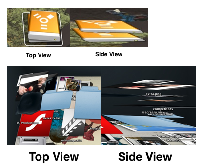
For one thing, Apple uses two-dimensional icons rendered three-dimensionally: that is, they're drawn from a 3-D perspective. That's fine if you're using the normal Mac desktop, but if you're using BumpTop and stack two of these icons on top of each other, it just looks weird and uncomfortable.

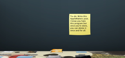
There's also the issue of "notes", which are similar to Stickies except you can pin them on the desktop or your virtual "walls". This could be a neat spin on to-do lists, but the thing is that the rear wall and bottom 10% of your desktop are completely offscreen. Not to mention the section hidden by the dock. This intro video uses an example of writing a gift list for your wife's anniversary on a note and hiding it from her by pinning it on the rear wall, but if you forget it's there, then it's virtually useless. And if you accidentally throw a file down to that netherworld of the bottom 10%, BumpTop gives you no hint that it's there. You've got to make a point of looking for it.

And it might be one thing if BumpTop actually functioned like it does in the demo video above, but the Mac version doesn't. When you lasso-select multiple files and then drag them, the "spatial relationships" between the documents aren't maintained whatsoever. Instead each file is thrown in a different direction vaguely correlating to the general orientation of your mouse drag, as if the files were connected via incredibly slack rope instead of the "springy cords" described in the video. (I haven't tested the Windows version or bought the premium version of BumpTop, although I think it would be a bizarre disincentive for the developers to limit the basic functionality of their physics engine to get you to pay full price.)
In summary, this seemed like a great idea in 2005, but what looks great in concept may be fundamentally unbearable in practice! At the very least, it's slightly fun to play around with for ten minutes, so download if you're curious... but don't expect to derive any utility from this not-quite-right program.


Comments
Nice try from Apple, but I don`t think we are quite ready for a 3d desktop yet. casual summer dresses